Surface and Upper Air Charts
Surface and upper air charts are the meteorologist's maps of the atmosphere: surface analyses show sea-level pressure, fronts and station observations, while upper air charts show the height, temperature and wind of standard pressure levels, from which the forecast winds and temperatures used in flight planning are drawn.
Before there were gridded forecasts and flight planning software, pilots and dispatchers planned from charts, and the charts are still how a forecaster, and an examiner, describes the atmosphere. Surface analysis charts show the pressure pattern and fronts at sea level together with plotted observations from each station. Upper air charts show the same atmosphere at the standard pressure levels where aircraft cruise, and the upper wind and temperature forecasts derived from them give the wind and temperature for every leg of a flight plan.
Reading these charts is a core skill for EASA and FAA examinations alike. The symbols are largely common to both, but the products differ: WAFS and national spot wind charts in Europe, the coded winds and temperatures aloft forecast (FB) in the United States.
Surface analysis and synoptic charts
A synoptic chart is built from observations made at the same time over a wide area, so that the whole weather situation can be seen at once. The surface analysis chart is the basic synoptic chart. It is an analysis of what was observed at the chart time, not a forecast; forecast versions of the same chart are called surface prognostic charts.
Its main lines are isobars, joining places of equal sea-level pressure. Meteorologists reduce station pressure to sea level with the actual temperature, giving QFF, not the QNH used on altimeters (see atmospheric pressure). The isobar interval is stated on the chart: 2 hPa on some charts and 4 hPa or more on charts of large areas. The US surface analysis is issued every 3 hours with isobars at 4 hPa intervals. Sea-level pressure normally lies between about 950 and 1050 hPa.
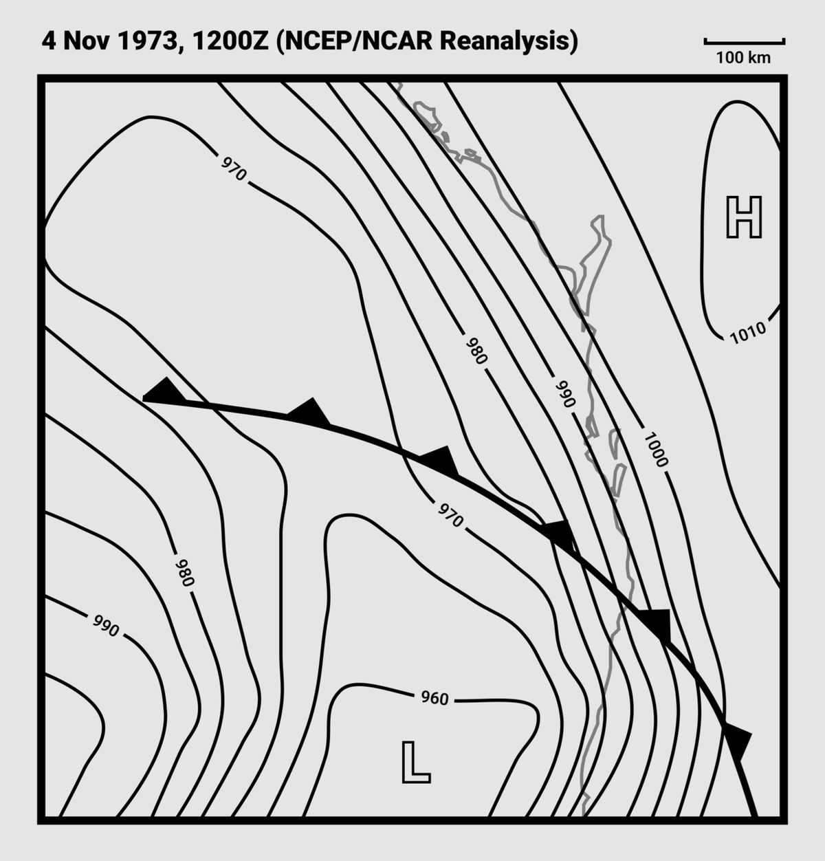
The isobar pattern shows the pressure systems (see pressure systems):
- closed lows, or depressions, marked L, and closed highs, or anticyclones, marked H;
- troughs, often V-shaped extensions of a low, and ridges, rounded extensions of a high;
- cols, areas of almost level pressure between two highs and two lows.
Fronts are drawn where the frontal surface meets the ground. Colour charts show a warm front as a red line with semicircles, a cold front as a blue line with triangles and an occlusion as a purple line with both, the symbols pointing the way the front moves; a stationary front alternates red semicircles and blue triangles on opposite sides of the line (see fronts).
Closely spaced isobars mean a steep pressure gradient and strong wind. Above the friction layer the wind blows almost parallel to the isobars; in the northern hemisphere, with your back to the wind, low pressure is on your left (Buys Ballot's law). Near the surface friction slows the wind and turns it across the isobars towards low pressure, so the surface wind is backed and lighter than the wind at 2,000 ft in the northern hemisphere (see wind forces and geostrophic wind).

Reading a station model
Each reporting station appears on a surface chart as a station model, a small circle with the observation plotted around it in fixed positions: the temperature, the dew point, the sea-level pressure and symbols for the present weather, with the wind drawn as a barb from the circle.
US charts plot the temperature and dew point in °F. The pressure is coded in three figures, the last three digits of the pressure in tenths of a hectopascal:
- a code above 500 takes a prefix of 9: 985 is 998.5 hPa;
- a code below 500 takes a prefix of 10: 012 is 1001.2 hPa.
A station model showing a temperature of 72, a dew point of 70, a southerly wind of 15 kt and 985 reports 72 °F with a spread of only 2 °F and a pressure of 998.5 hPa, moist air in which fog and low stratus are likely.
Wind barbs
The wind barb is the standard way of plotting wind. The shaft points from the station into the wind, towards the direction it is blowing from, and the speed is given by the marks on its outer end:
| Symbol | Speed |
|---|---|
| Half barb | 5 kt |
| Full barb | 10 kt |
| Pennant (solid triangle) | 50 kt |
A shaft extending to the north-west with one pennant and two full barbs therefore shows a north-westerly wind of 70 kt. ICAO upper wind charts use the same barbs on an arrow whose head points downwind, the way the wind is blowing: an arrow with one pennant, two full barbs and a half barb shows 75 kt.
Wind directions on charts, in METARs and in upper wind forecasts are in degrees true. The wind given by ATC and the ATIS is magnetic, so that it can be compared directly with the runway direction.
Exam tip: a plain barb on a station plot points into the wind; an arrow on an upper wind chart points downwind. The feathers count the same way on both: 50, 10 and 5 kt.
Constant pressure charts and standard levels
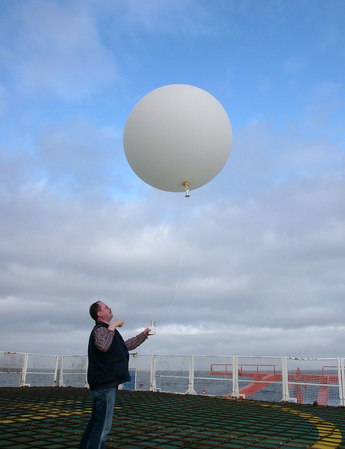
Upper air charts are drawn not for a fixed height but for a constant pressure surface, such as 500 hPa, which rises and falls across the chart. The data come from radiosondes, instrument packages carried aloft by balloon from about 900 stations at 0000 and 1200 UTC, from aircraft reports and satellites; the charts themselves are now mostly drawn by computer from the forecast models' analyses.
The standard pressure levels used for these charts correspond, in the ICAO standard atmosphere, to familiar flight levels:
| Pressure level | Approximate flight level |
|---|---|
| 850 hPa | FL050 |
| 700 hPa | FL100 |
| 500 hPa | FL180 |
| 300 hPa | FL300 |
| 250 hPa | FL340 |
| 200 hPa | FL390 |
Because a flight level is itself a surface of constant pressure, a chart for the 300 hPa level describes the conditions at about FL300, whatever the true height of that surface on the day. That makes the charts easy to use for cruise planning, and it explains a classic exam question: if the 300 hPa chart shows −54 °C and the tropopause is at FL330, the temperature at FL350 is about −60 °C. The −54 °C applies at FL300; the temperature keeps falling by about 2 °C per 1,000 ft up to the tropopause, then stays constant above it (see the atmosphere).
Contours (isohypses)
On a constant pressure chart the lines are not isobars but contours, or isohypses: lines joining places where the pressure surface lies at the same height above mean sea level. The heights are usually given in decametres, so a contour labelled 522 on the 500 hPa chart means the 500 hPa surface lies 5,220 m above mean sea level.
Contours are read like isobars:
- high contour values mean high pressure aloft, and low values low pressure aloft. Pressure falls faster with height in cold air, so upper lows and troughs usually lie over cold air and upper highs and ridges over warm air;
- the wind blows almost parallel to the contours, faster where they are closer together;
- in the northern hemisphere, with your back to the wind, low pressure, low temperature and low contour heights are all on your left; in the southern hemisphere they are on your right.
Upper air charts also carry isotherms, lines of equal temperature, and isotachs, lines of equal wind speed. Where the isotachs crowd around an elongated maximum the chart shows a jet stream, and the strong shear around it warns of clear air turbulence (see jet streams).
Upper wind and temperature charts
The upper wind and temperature chart is the forecast version used for planning. The WAFS charts, produced from the World Area Forecast Centres' gridded forecasts, give the wind as an arrow and the temperature in °C at points every 5° of latitude and longitude, for flight levels that include FL300, FL340 and FL390, the 300, 250 and 200 hPa levels. A chart that gives values only at selected points in this way is often called a spot wind and temperature chart.
Like the significant weather charts, these are fixed-time charts. The pilot interpolates three ways: between grid points along the route, between levels, and between charts for times in between. A worked example: the chart gives 240/20 at FL050 and 240/40 at FL100, and the planned level is FL080 on a track of 210° true. FL080 is three fifths of the way from FL050 to FL100, so the wind is 240/32. It blows 30° off the nose, giving a headwind component of 32 × cos 30°, about 28 kt, and a crosswind of about 16 kt.
Airline flight planning systems do the same sums automatically with the gridded WAFS data, and the result appears as the wind and temperature columns of the operational flight plan (see meteorological services and briefings).
UK Form 214 and 414
In the United Kingdom the low-level equivalent is Form 214, with Form 414 as the night chart. It gives spot winds and temperatures at selected locations in boxes, with heights in thousands of feet above mean sea level, not flight levels, to match the low-level significant weather chart, Form 215. Winds for a route are found by interpolating between the height bands and between neighbouring boxes, and consecutive forms show how the wind changes through the forecast period.
Winds and temperatures aloft forecast (FB)
The US winds and temperatures aloft forecast (FB), the winds aloft forecast of FAA examinations, is a coded text product. It is issued four times a day, with forecasts for 6, 12 and 24 hours ahead; the pilot uses the one whose valid time is closest to the flight. Each station line gives the wind and temperature at fixed levels, as in this example for Oklahoma City, whose header line (FT) lists the levels in feet:
| FT | 3000 | 6000 | 9000 | 12000 | 18000 | 24000 | 30000 |
|---|---|---|---|---|---|---|---|
| OKC | 2315 | 2320+12 | 2425+06 | 2530-02 | 2645-14 | 2750-26 | 771850 |
Each group reads DDff±TT: direction in tens of degrees true, speed in knots, temperature in °C.
| Group | Level | Decoded |
|---|---|---|
| 2315 | 3,000 ft | 230° at 15 kt; no temperature |
| 2320+12 | 6,000 ft | 230° at 20 kt, +12 °C |
| 2645-14 | 18,000 ft | 260° at 45 kt, −14 °C |
| 771850 | 30,000 ft | 270° at 118 kt, −50 °C |
The rules behind the gaps and the odd codes:
- no wind is forecast for a level within 1,500 ft of the station's elevation;
- no temperature is forecast for the 3,000 ft level or for any level within 2,500 ft of the station's elevation;
- for speeds of 100 kt or more, 50 is added to the direction and 100 subtracted from the speed, so a direction code from 51 to 86 signals the change;
- above 24,000 ft temperatures are always negative and the minus sign is omitted.
For a cruise between two levels the pilot interpolates. At 7,500 ft, halfway between 2320+12 at 6,000 ft and 2430+06 at 9,000 ft, the forecast is 235° at 25 kt and +9 °C.
Exam tip: in 771850, 77 minus 50 gives 270°, 18 plus 100 gives 118 kt, and 50 above 24,000 ft is −50 °C.
Frequently asked questions
How do you read a wind barb?
The shaft points from the station towards the direction the wind is blowing from. Speed is read from the marks at the outer end; a half barb is 5 kt, a full barb 10 kt and a pennant 50 kt. A shaft to the north-west with one pennant and two full barbs is a north-westerly of 70 kt. Wind directions on charts are degrees true.
What does 522 on a 500 hPa chart mean?
It is a contour, or isohypse, value in decametres. The line joins places where the 500 hPa surface lies 522 dam, or 5,220 m, above mean sea level. Higher values mark high pressure aloft and lower values low pressure aloft, usually over cold air. The wind blows almost parallel to the contours, faster where they are close together.
Which flight levels correspond to the standard pressure levels?
In the ICAO standard atmosphere 850 hPa lies near FL050, 700 hPa near FL100, 500 hPa near FL180, 300 hPa near FL300, 250 hPa near FL340 and 200 hPa near FL390. Because a flight level is itself a constant-pressure surface, a chart for one of these levels describes the conditions at that flight level whatever the true height of the surface on the day.
How do you decode 771850 in an FB winds aloft forecast?
When the forecast speed is 100 kt or more, the forecaster adds 50 to the direction and subtracts 100 from the speed. A direction code of 77 is therefore 27, or 270 degrees, and a speed code of 18 is 118 kt. Above 24,000 ft temperatures are always negative and the sign is omitted, so 50 means minus 50 degrees Celsius.
What is the difference between an isobar and an isohypse?
An isobar joins places of equal pressure on a surface of constant height, normally mean sea level, and is drawn on surface analysis charts. An isohypse, or contour, joins places where a constant-pressure surface such as 500 hPa lies at the same height above mean sea level, and is drawn on upper air charts. Both show the wind in the same way.
Test yourself on Surface and Upper Air Charts
The v1prep banks cover this topic in Meteorology (050), with a worked explanation for every answer. EASA ATPL, PPL, IR and CPL, the FAA written tests and A320/B737 type ratings.
Start practising →Sources and further reading
- FAA-H-8083-28B, Aviation Weather Handbook (surface analysis, constant pressure charts and winds and temperatures aloft)
- FAA Pilot's Handbook of Aeronautical Knowledge (FAA-H-8083-25), Chapter 13, Aviation Weather Services
- NOAA Weather Prediction Center, Station Model Information for Weather Charts
- NOAA JetStream, Air Pressure
- ICAO Annex 3, Meteorological Service for International Air Navigation
- U.S. Standard Atmosphere, 1976 (NOAA, NASA and US Air Force), NASA Technical Reports Server
Library articles are written for study and exam preparation. They do not replace your aircraft's approved documentation, your operator's procedures or the regulations themselves.